


The University of Washington Botanic Gardens Arboretum is home to more than 15,000 plants and trees. It’s easy to (figuratively) get lost in its 230 acres, but the Arboretum wants to help its visitors find their way through its vast gardens and plant collections.
The Arboretum enlisted the help of SpatialDev to enhance an existing web application that catalogs all of its plants and points of interest such as benches, plant mass areas, trails, and gardens.
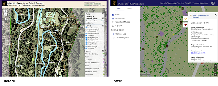
The previous interactive map was designed for desktop layouts. We redesigned the experience with a mobile-first approach to assure an optimized experience for users – whether they were at home planning their visit to the park or were already actively exploring the Arboretum. In addition to enhanced Search functionality, some of the features we implemented were a user’s ability to:
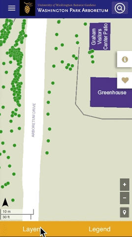
• Find their location on a map.
• Click on a plant or tree on the map to display a user friendly panel that shows details.
• Add plants to a “favorites” list and store them in the background without a user login.
A big part of our effort went to building a responsive mobile and desktop application while using their existing back-end solution. We worked with a dynamic map service resource exposed by their ArcGIS Server REST API. The basemap and mapping layers are hosted by the University of Washington.
Since we used AngularJS as the web framework, Material Design was the perfect framework for the design elements because it adapts across different devices and screen sizes. Angular Material layout API consists of many breakpoints to easily support responsive simple layout, using its easy-to-use markup convention “layout-xs”, “layout-sm”, or “layout-md”. Here’s a link to learn more about the responsive breakpoints layouts, which work well on all devices.
In order to achieve a layout suitable for mobile devices and desktops, we often used the show(italic) hide(italic) APIs to responsively show or hide elements. Very similar to ng-show and ng-hide, these Angular Material Layout directives are mediaQuery-aware. Here are several screenshots of the application’s mobile layout and desktop layout:
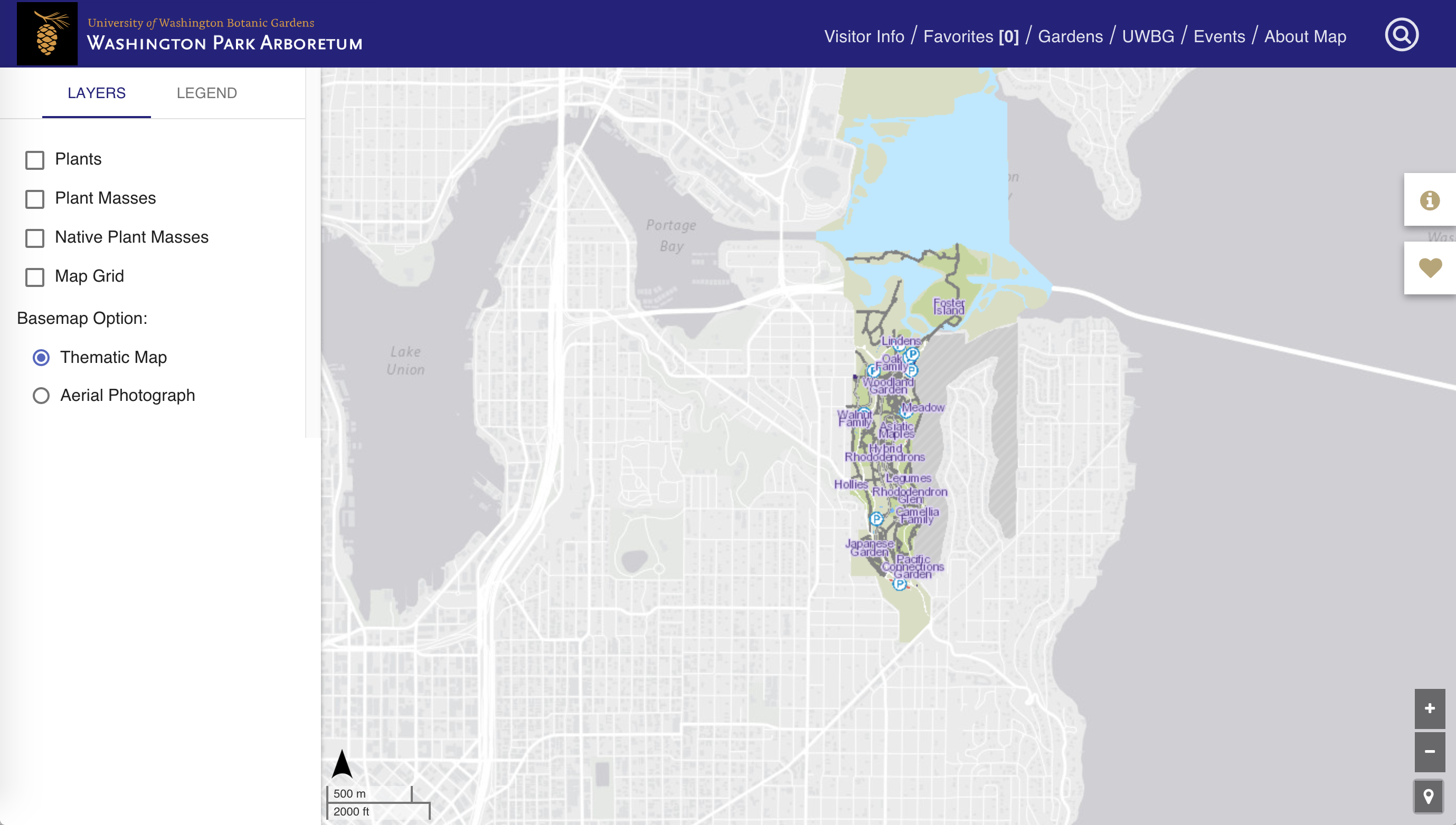 Desktop layout
 Some of the mobile element transitions
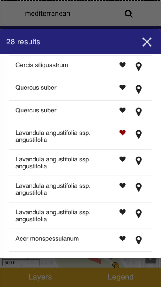 The user can do a search by name, keyword, geography, or accession number and get a results list.
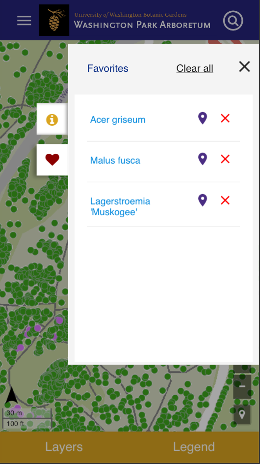 Favorite plant list
We also leveraged other open source tools:
• Leaflet mapping library for the map
• ESRI-Leaflet plugin to allow us to overlay dynamic map services on leaflet
• Angular-localForage for the favorites feature
• Leaflet-locatecontrol plugin to find user’s geolocation
The best part of this project was being able to spend time at the Arboretum. Some of us (UW alums included) had never visited the park; we were blown away by its beauty. Be sure to put the Arboretum on your to-do list and let the new, improved Arboretum app help guide you on your way.