

While most of us here in Ballard, Seattle are still getting over our food coma from last weekend’s Seafood Fest, we wanted to take a moment to showcase a brief case study on data-driven design.
For the past 3 years, SpatialDev has teamed up with Ballard Alliance to create the Seafood Fest’s interactive mapping experience to help attendees find their way through the many food stands, vendors and entertainment the festival has to offer. Before tackling this year’s interactive map, we looked at some key metrics from last year to get a better sense of what worked and where to look for potential improvements.
Seafood Fest Map, 2016 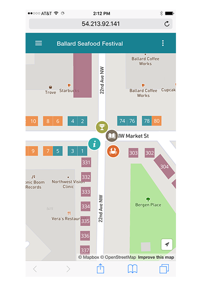
We started by reviewing site traffic and engagement stats from last year. We learned that the custom map icons (crab shack, info booth, eating-competition) were the most popularly selected locations on the map. Unfortunately, there was very little interaction with the rectangular vendor polygons styled by color. Also, very few users clicked on the ellipsis icon on the far right corner of navigation toolbar – built to open up a menu with categorized lists of the various food, arts & crafts, and entertainment offered at the festival.
We decided to make a few changes to help create a more engaging map experience.
Seafood Fest Map, 2017 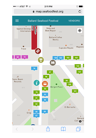
-
Taking a closer look at the vendor polygons on the map, we realized the rectangles aligned along the street didn’t feel clickable. To make them pop, we ditched the polygon approach and used the centroid of each vendor as a point, then styled them with colorful custom map pins & bold white labels.
-
To eliminate any confusion about the ellipsis on the navigation bar, we replaced it with the word “Vendors”. The ellipsis icon was very small, & not as intuitive as we hoped, resulting in users probably missing it all together. This very subtle change made this feature more prominent.
-
When the interactive map first launches, the left menu is expanded by default (for first time users) to help guide the user to see some of the highlights of the festival. We realized that last year’s “don’t miss” list was missing one key category, FOOD! This is, after all, the SEAFOOD FEST! For a quick fix we added a “Food Vendors” link, allowing the user to quickly access a list of all food vendors participating in the festival.
-
We also added the geolocation functionality to the map, allowing users to find points of interests around their current location.
RESULTS:
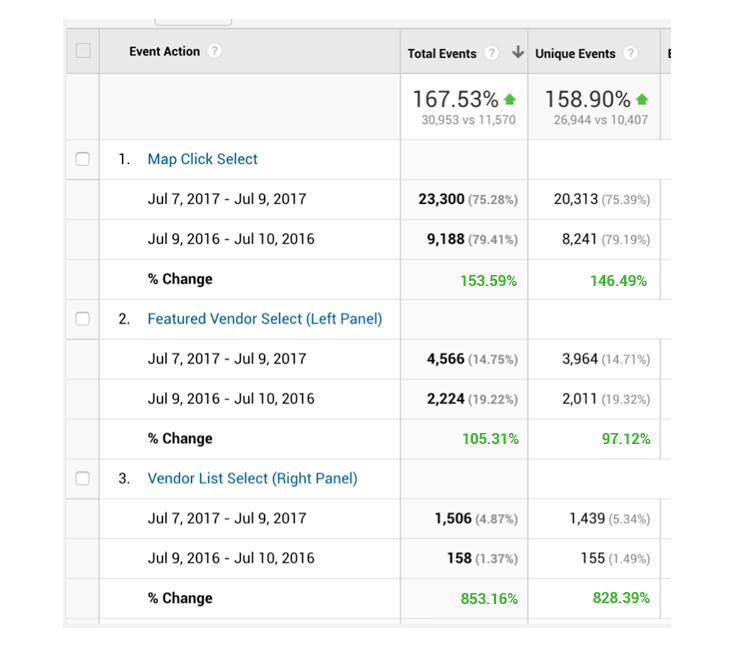
The results are outstanding! As you can see, overall engagement skyrocketed. Users interacted with our new map pins twice as much as they did last year. Also, you can see the spike in total & percentage of overall selections of our new “Vendors” label on the navigation bar.
It’s incredible how much of a difference subtle changes to your app can make. All of this was done with very little changes to application code. Most of the hard work is handled by our custom, data-driven Mapbox vector map.
“It’s the little details that are vital. Little things make big things happen.” - John Wooden